
EF ULTIMATE BREAK
My role
Color Refresh
My role
Digital Designer
Project collaborators
Cam Walsh, Digital Designer
Sarah Heingartner, Art Director
When I joined Ultimate Break, we were seeing a renaissance of travel in the world. People were getting out there, booking trips, and having experiences of a lifetime. As a brand we wanted to reflect this excitement and decided it was time for a color refresh. Our team of three researched color trends, testing on existed assets, and iterated countless palettes over the course of several months. Our new palette not only better reflects us as a brand, but represents the vibrancy in the travel community of EF Ultimate Break.
With our new palette, we wanted to satify a few main objectives: flexibilty, brand recognition, and diversity. Our previous palette consisted of blues and oranges and often we ran into the issue where color would look great on a select few photos but would clash or become ultimately unreadible on others.
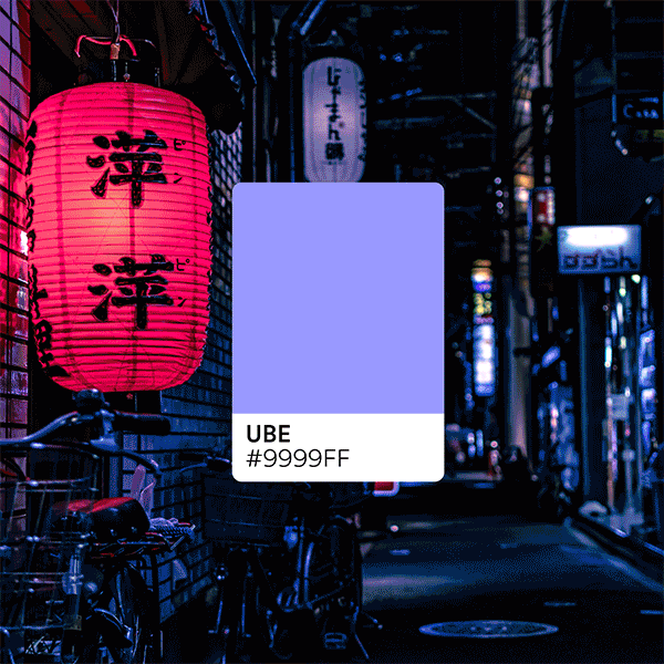
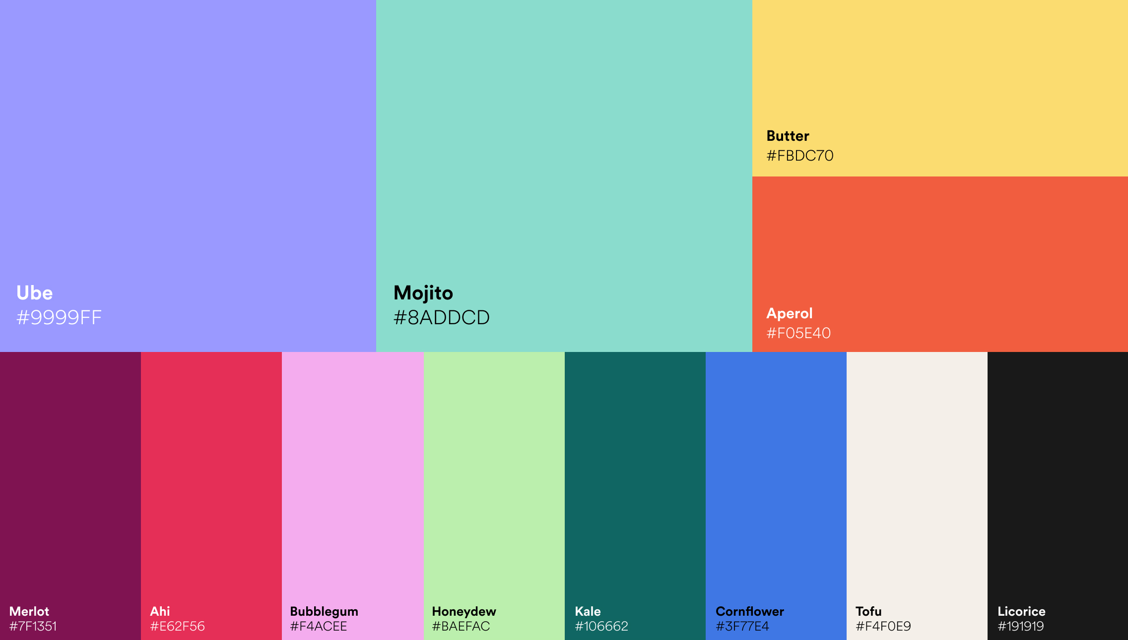
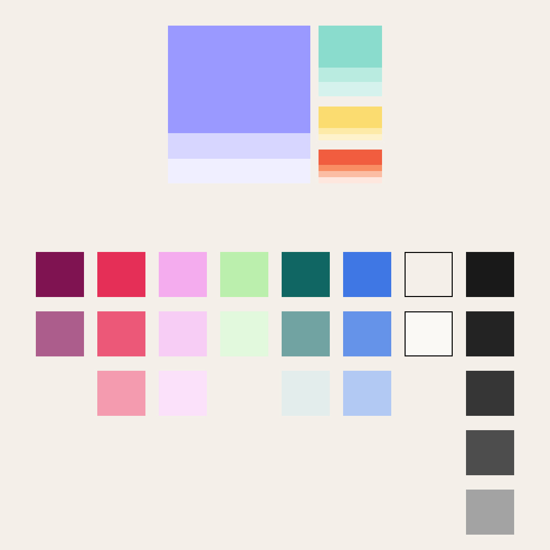
This new palette has a wide range of values and can compliment nearly any asset. Our main four values are Ube, Mojito, Butter, and Aperol with a secondary palette of bold warm and cool tones. This range of colors reflects the diversity of trips and the uniqueness of each location we visit.
This new palette has a wide range of values and can compliment nearly any asset. Our main four values are Ube, Mojito, Butter, and Aperol with a secondary palette of bold warm and cool tones. This range of colors reflects the diversity of trips and the uniqueness of each location we visit.


BEFORE & AFTER

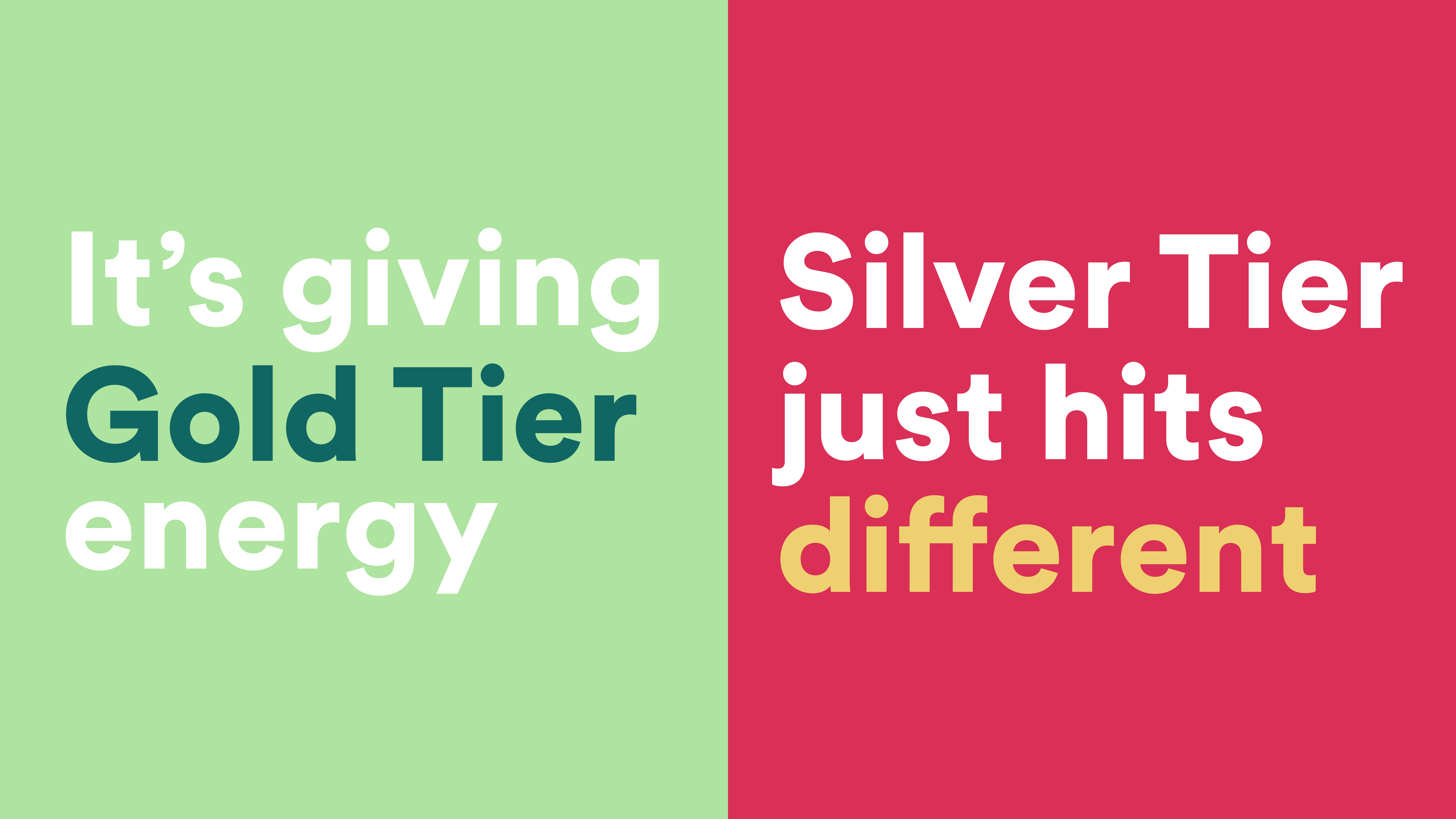
As Ultimate Break grew, our colors didn’t quite have the oomph factor we wanted to bring to our travelers. Even simple pages and graphics became lost in the sea of other tech blues and alert oranges. The palette can flex with our needs, standing out when we want to and blending in when we need to. With the updated colors, we can better compliment photos of our trips with graphics that make them stand out and adjust to our different audiences.
•••••
![]()
![]()
![]()
![]()
![]()
![]()
![]()
![]()